
English

Views: 0 Author: Site Editor Publish Time: 2026-05-11 Origin: Site


Designing event credentials is an operational decision. It goes far beyond simple aesthetics. A poorly planned design creates immediate gate bottlenecks. It easily compromises event security protocols. It also cheapens brand perception when physical products drastically deviate from digital proofs. Planners face immediate logistical nightmares when visual verification fails at the door. You need a reliable, professional strategy. A successful design perfectly balances rapid visual verification, highly durable materials, and precise production tolerances. You must match the physical item to the event lifespan. This comprehensive guide breaks down the physical printing realities you will face. We explore technical specifications and advanced security integrations. These elements are strictly required to produce a highly functional, professional-grade product. You will learn how to optimize typography for curved surfaces. We also show you how to prepare flawless technical files. Master these fundamentals, avoid costly production errors, and elevate your next live event.
Material dictates design: Complex designs require wider bands (25mm) or premium materials, while minimal text suits standard 12mm sizes.
The 3-Second Rule: Security staff must be able to read key identifiers instantly in low-light environments. Contrast and font size (minimum 8pt) are non-negotiable.
Placement matters: Essential logos must sit on the left side of the band to remain visible after wrapping and securing.
Print-ready files prevent delays: Submitting 300 DPI vectors in CMYK with Pantone matches eliminates color shifts and pixelation.
Tech upgrades enhance ROI: Integrating an RFID wristband or QR code transforms a static entry pass into a data-gathering tool.
Before you open any design software, you must align the physical material to your event duration. You must also consider the specific audience use case. Failing to match materials to real-world environments often causes mid-event product failures.
Different events demand distinctly different material properties. A single-day concert requires vastly different credentials than a month-long corporate awareness campaign.
Short-Term/High-Volume: Tyvek represents the industry standard for events lasting one to two days. It provides a highly cost-effective solution. The material acts in a tamper-evident manner. It shreds easily if someone attempts to remove and transfer it. Tyvek is also highly recyclable.
Multi-Day/VIP: A woven wristband offers a truly premium tactile feel. Woven threads physically prevent counterfeiting over a three-to-five-day festival. Guests often keep these credentials long after the festival concludes.
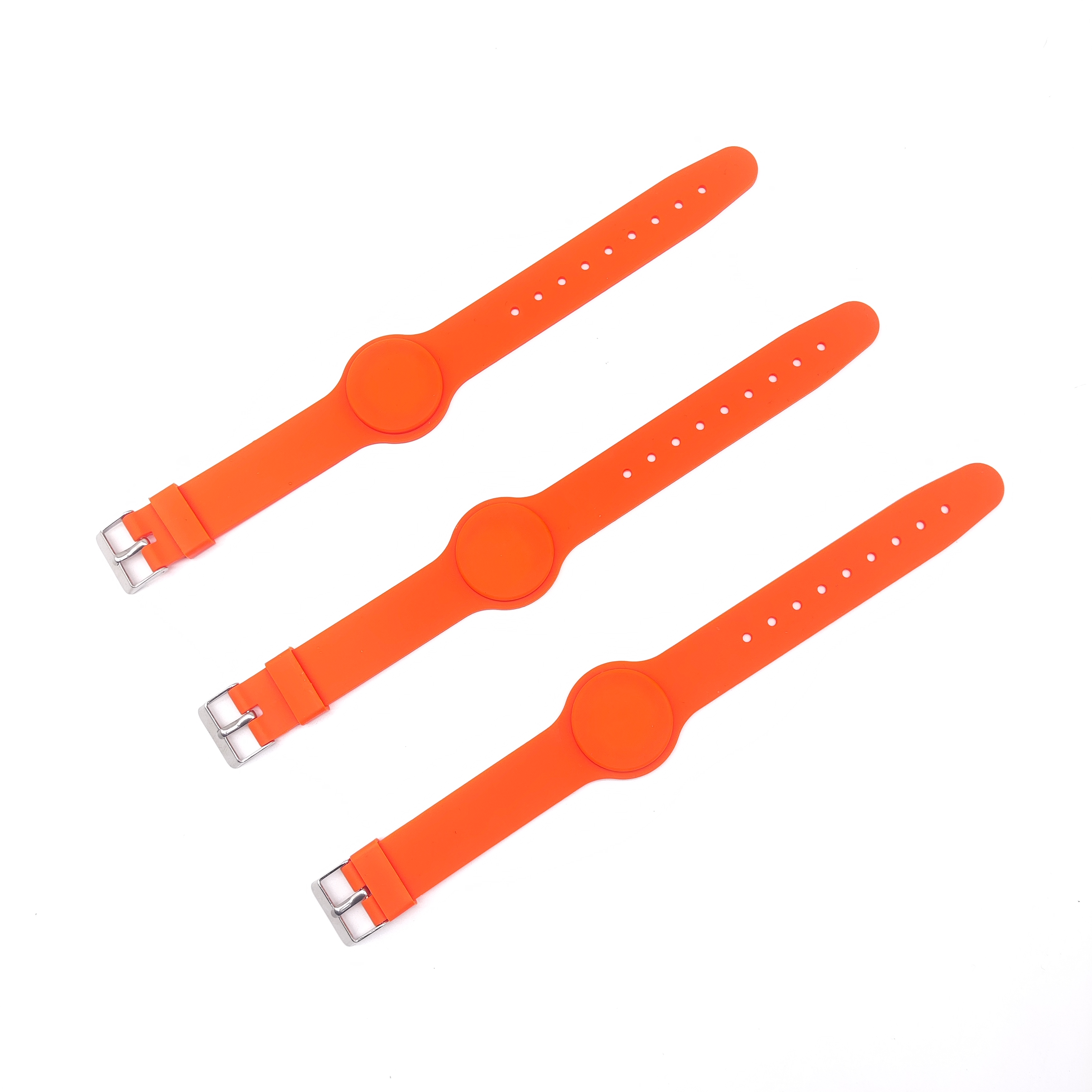
Long-Term/Promotional: A silicone wristband or an Elastic Wristband provides durable brand retention. These waterproof options easily support ongoing awareness campaigns. They work perfectly for fitness tracking routines or corporate gifting programs.
Material Type | Ideal Lifespan | Primary Benefit | Typical Use Case |
|---|---|---|---|
Tyvek | 1-2 Days | Tamper-evident, cost-effective | General admission, nightclubs |
Woven Fabric | 3-5 Days | Counterfeit-resistant, premium feel | VIP access, music festivals |
Silicone | Months to Years | Waterproof, highly durable | Promotions, charity campaigns |
Elastic | Weeks to Months | Stretchable comfort, reusable | Fitness tracking, brand merch |
Physical dimensions directly limit your creative canvas. You must scale your width appropriately.
Stick strictly to the standard 12mm (half-inch) size for basic text applications. Scale up to 25mm (one inch) if utilizing heavy artwork. You also need a 25mm width for intricate logos or large QR codes. Avoid cramming complex art onto 6mm ultra-thin bands. Fine details will blur completely during the manufacturing process.
Security closures represent another vital choice. Choose single-use adhesive strips to prevent ticket sharing. You can also utilize locking plastic toggles for fabric materials. These one-way toggles feature internal teeth. They slide on easily but lock permanently in place. Use reusable snap closures only for VIP guests requiring long-term access across multiple venues.
Designers often face a critical implementation risk. Artwork looking perfectly balanced on a flat, backlit monitor frequently becomes illegible in real life. It warps when curved around a wrist. Venues often feature extremely poor lighting conditions.
Security staff must process entry lines quickly. They utilize a strict "3-Second Rule" during visual inspections. If guards cannot verify the credential within three seconds, gate queues will stall immediately.
Contrast dictates readability. Rely strictly on opposing colors from the standard color wheel. Place dark text on neon or fluorescent backgrounds. This combination maximizes readability in dark environments. Avoid pairing similar hues, such as navy blue text on a black background.
Typography requires equally strict discipline. Never drop below an 8-point font size. Discard thin, cursive, or intricate script fonts completely. Instead, favor bold, sans-serif typefaces. Standard options like Arial Bold, Roboto, or Impact survive the physical printing process beautifully. Delicate fonts often fall victim to ink bleeding on fabric or silicone surfaces.
Using delicate script fonts for vital age-verification details.
Ignoring physical ink bleed tolerances on woven materials.
Placing white text on pale yellow backgrounds.
Using condensed fonts lacking sufficient kerning (letter spacing).
Curvature reality dictates placement rules. Wristbands wrap around a human arm. When an attendee secures the band, the right side almost always overlaps. Staff often cut off excess material entirely.
You must implement an actionable fix. Anchor your core message to the left-center of your design template. Place your primary brand name exactly there. Specifically, keep critical art away from designated "safety margins." Avoid the adhesive zones and snap-closure areas completely. Designing entirely in the center usually results in your logo wrapping awkwardly around the side of the arm.
The quality of your raw assets directly dictates final product sharpness. It also controls color accuracy during the final print run. Digital previews often create false confidence.
You must abandon 72 DPI web graphics immediately. Low-resolution images look pixelated and unprofessional when physically printed. Provide 300 DPI minimums for any rasterized image. Ideally, you should supply vector formats instead. Use .AI, .EPS, or .SVG file extensions. Vector files utilize mathematical equations rather than static pixels. They allow completely lossless scaling.
Color profiles require equal attention. Digital monitors display RGB (Red, Green, Blue) light. Physical printers utilize CMYK (Cyan, Magenta, Yellow, Key/Black) ink. You must convert digital RGB files to CMYK before submission. Failing to do so causes dull, muddy physical prints. Bright digital blues often convert into dark purples. For strict corporate branding, supply specific Pantone (PMS) color codes. Pantone codes guarantee precise factory matching across different material runs.
Understand exactly how long the design needs to survive. You must choose between surface applications and depth applications.
A standard printed wristband allows for full-color, highly complex graphics. However, surface ink frequently experiences friction wear over time. If attendees wear the band in swimming pools or showers, basic ink can fade quickly.
For permanent longevity, evaluate debossed options. Debossing physically recesses the design down into the material itself. You can also request debossed color-filled options. Factories inject physical ink into the recessed cavities. The text physically cannot rub off, ensuring your brand message lasts for years.
Imprint Method | Visual Detail Level | Durability Rating | Best Application |
|---|---|---|---|
Surface Screen Print | High (Full Color) | Moderate | Short-term events, complex logos |
Standard Debossed | Medium (No Ink) | Maximum | Subtle corporate branding, charities |
Debossed Color-Filled | Medium (Solid Colors) | Maximum | Long-term awareness campaigns |
Jacquard Woven | Low (Thread based) | High | Multi-day outdoor festivals |
Basic visual checks prove insufficient for enterprise-level events. Event credentials must serve as active operational assets. You need scalable security solutions to prevent revenue loss.
Digital integration changes everything. Specify an RFID wristband or NFC-enabled band for your next major event. Smart chips transform static entry passes into powerful digital tools. They enable seamless cashless payments at vendor tents. They provide fast-lane entry for VIP attendees. Furthermore, they deliver real-time crowd flow analytics directly to event organizers. You can track exactly where attendees spend their time.
If smart tech breaks your operational budget, you must layer analog security upgrades instead. Analog anti-counterfeit measures remain highly effective.
Sequential Numbering: Print a unique serial number on every single band. Staff can track exactly which numbers correspond to valid ticket buyers.
Variable Data Printing (VDP): Print unique barcodes or guest names directly onto individual bands during the manufacturing run.
Micro-Text Integration: Embed extremely tiny text into the background design. Counterfeiters cannot replicate micro-text using standard commercial printers.
UV-Reactive Inks: Utilize specialty metallic or ultraviolet inks. Security guards can quickly verify authenticity using simple handheld blacklights at the entry gate.
Effective event credential design requires a deeply pragmatic balance. You must carefully weigh brand aesthetics against physical printing limitations. Curved, wearable materials present unique challenges. You cannot treat them like flat paper posters.
Audit your current design immediately. Check it against the 8-point font minimum rule. Verify your left-side placement strategy. Next, request physical material samples from your supplier. Access a dedicated design template to test your vector files properly. Verify your art stays within true safety margins. Taking these precise steps guarantees a flawless bulk production run.
A: Adult sizes generally default to 10 inches in length for Tyvek or plastic materials. They typically measure 8 inches in circumference for silicone variants. Youth or child sizes run considerably smaller, usually closer to 6 or 7 inches in circumference. Always verify specific dimensions with your supplier before ordering.
A: Yes. Tyvek acts as a High-Density Polyethylene (HDPE). Specialized programs like TerraCycle recycle it 100 percent. Recycled silicone provides another excellent sustainable option. Additionally, factories now produce woven bands using rPET (recycled plastic). These choices easily support strict ESG-compliant procurement policies.
A: Digital monitors display images in RGB formats using light. Physical printers output CMYK formats using physical ink. A color shift remains inevitable during production if you fail to convert your files. We strongly recommend correcting your files to CMYK or matching them to a specific Pantone standard beforehand.


